by Linda | Mar 10, 2012 | my creative journal

While organizing my bookshelf, I came upon some half-finished journals and sketchbooks. I’m constantly making new journals, trying new papers and formats. So that creates a whole lot of mess when it comes to chronology or any sense of completion. I rarely date pages and work out of order all the time. You can call it freedom, but it’s also chaos.
I also don’t share all my art journal pages because they can be pretty mundane, just a book of my random musings. Or they can be a flood of negative emotions, something I don’t want to post publicly. I don’t shy away from destroying pages or even entire journals. I take them apart and keep only what I like. It’s a way for me to process negativity. As time passes, certain pages don’t hold the same meaning anymore.
Although it may seem unauthentic to edit, there really is no right or wrong way to art journal. And no one says you have to treat them as masterpieces to keep forever, it’s all up to you. And honestly, we edit everything in life! There would be too much to consume otherwise. I personally really like the feeling of cleaning things out, making room for the new.

Of course, I’ve been trying to see things from a different perspective and thought I might try being more systematic. Work in one journal before going to the next. Going for simplicity and positivity in the end. Maybe that would eliminate the need for me to edit after the fact.
What is your creative art journaling process? Have a favorite journal? Do you destroy or toss things out? Would love to know how others keep or don’t keep their sketches/notes/musings.
by Linda | Mar 9, 2012 | my creative journal
I’ve been working a lot with geometric shapes in my design work lately and created a shell or scallop pattern. I thought the pattern would make great background papers, so here’s a mini pack for your personal use. There are a variety of scales and colors included, along with a oh-so-touchable canvas texture to these papers… hope you like ’em!

Download Shell Papers ZIP (74mb)
If you like this freebie, please help me spread the word to your crafty friends. You can keep updated by signing up to my email newsletter as well. Thank you and enjoy!
by Linda | Mar 8, 2012 | my creative journal
This past week, I’ve been following along the Right-Brainers in Business Video Summit and realizing I need more foundation. Although it’s not good to be stuck in the stage of forever planning or analysis paralysis – when diving into action we inevitably will reach a point of needing more direction, just the same.

I can be an impatient person, jumping into something to follow my inspiration and spark of energy. But we all know that those spurts can’t be sustained without a bigger plan. At least, that is how I feel right now. I go through cycles of high productivity mode to the slump, confusion, and crisis mode. It’s not a good cycle. I want more tranquility in my life and although it’s impossible to have complete balance, I would like to reach some kind of… equilibrium that I’m happy with.
I’ve realized that my left-brain ways of planning can only take me so far… why am I not using my right-brain skills, as well? I’m sure there’s something that can help me with building my business as an artist and illustrator – duh!? We usually think of business and marketing as left-brain skills, but maybe that is narrow minded. I can’t really explain it, but I just connected and felt that I needed to go down this path. I have heard of Jennifer Lee’s book, The Right-Brain Business Plan (Amazon link) before, but had the impression that it was the easy way out for those who didn’t want to do a real business plan. Now that I’ve learned more about it, I realize my error. It is a detailed book with a whole lot of information – simply presented differently. I finally ordered it and can’t wait to get started.
Realizing how my perspective changed for this specific thing, suddenly made me wonder if I’m blocking myself out of a whole lot of things in life and business. We all make assumptions and generalizations. Is it blinding us from seeing, accepting, or considering those things that might help us out? I truly mean no offense, but I used to think yoga and zen stuff was all hokey and weird. Oh, I’m not into that stuff, I thought. I’m practical and grounded. I suppose the only way to explain it… is that we fear the unknown.
Although I don’t run out with open arms to every single new thing out there, I do feel much more open-minded nowadays. In fact, I try really hard to remind myself, that whatever I feel, it is just the first impression. And we know how our impressions of things change dramatically over time.
So all this to say, this week, I’ve been in a soul searching type of mood. I’m making plans, organizing and cleaning up my space. I’m making room for the work I need to do.
If you want different results, then you have to change the way you are doing things, right? Do you have a business plan? Have you assessed your progress and adjusted your course along the way? Perhaps you need to open your mind to new things?
BTW, happy International Woman’s Day, festa della donna here in Italy. It’s our day. Let’s do something awesome!
by Linda | Mar 7, 2012 | my creative journal
This doodle illustrates how lame I can be…

*chuckle*chuckle*
Seriously, very funny! Multi layered and the lines of her outfit, you know? Okay, it’s funny to me anyway…
by Linda | Mar 7, 2012 | DIY printables
Looking for a cute tweet tweet birdie image to color up?

Here’s a little something I illustrated and feel free to download for your personal use – Heart Tweet Digistamp. Just please do me a favor and spread the word to all your crafty friends.
For weekly updates on my printables sign-up for my newsletter!
by Linda | Mar 1, 2012 | my creative journal
We don’t like to talk about money, not just creatives, but everyone. It’s uncomfortable for whatever reason.
Art of Money – Tara Gentile
We’ve all been taught that it’s not so polite to talk about money. I don’t know why, but the subject is taboo. It’s too prying to ask someone how much they make a year. It’s pompous to announce how much profit you’ve made from a great product release.
We are always reluctant to reveal numbers and figures.

Maybe because we aren’t making enough for our efforts and it’s embarassing. Or maybe because you don’t want to shine the light on your monetary success for fear of resentment or targeting by scammers.
Whatever the reason, the lack of discussion makes us all a bit clueless when it comes to understanding money. In a hush hush environment, we are bound to make incorrect assumptions. The more we don’t talk about something – the lack of education – the more problems come out of it. No surprise that creatives always have a hard time pricing their work and services. There are no perfect formulas or a widely accepted rate standard. Actually, there are professional rates published in the Graphic Artist’s Guild Handbook of Pricing and Ethical Guidelines (link to Amazon.com) … but it doesn’t apply to all the creative work that is done today. Also depending on your lifestyle and location, worth and pricing seems to change.
I think that being clueless means that we don’t know our own worth. Money is an important and necessary part of our lives. We need money to survive, even it it’s not everything of course. It’s just another element that shouldn’t be pushed under the carpet or banned to underground communications.
It’s nice to know that many folks are opening up and discussing the topic of money. Pat Flynn from Smart Passive Income actually posts his income reports on the internet, sharing the sources in detail. Maria Brophy has just written a post about how money is commitment. Tara Gentile’s book, The Art of Earning, opens up a conversation on the topic of money and wealth.
I hope that one day, I won’t hesitate so much to talk about money, numbers and figures. I want to know my self-worth and treat money as just another “thing” in life. No taboo, no shame, no fuss. I hate the “starving artist” term and I would like “thriving artist” to replace it. If you think about creatives of all types – the passion, joy and empowerment of their work should be the thing that comes to mind. Not the starving, you can’t make a living or struggling lifestyle notions that are usually brought up in conversation.
What’s your relationship with money? Do you often hesitate to talk about it? How would you like it to change? Let’s talk about money.
by Linda | Mar 1, 2012 | my creative journal
You might have guessed from my blog name, BackToPaper, that I ventured into the digital world too far and eventually found my way back to the tactile world of sweet, lovely paper. Indeed I was a digital junkie since age 14, chatting on IRC with friends and building my own blinky marquee type websites. I was a totally geek and started blogging and eventually got into all aspects of digital design. Years later, I just fell out of it all. Little time in college and even less time when I started working.

When being on the computer became a work activity, I yearned for off screen time. I turned to old fashioned crafting and handmade hobbies. Over time, I realized there was a need for balance. I love digital for so many reasons, but love the non-digital as well. Perhaps it is not surprising that my scrapbooking is hybrid to the core. Nowadays, isn’t it always hybrid with printing digital photos and journaling? But why not take it a step further and print your own pattern paper?
I’ve found that it’s really easy and simple to print all those beautiful digital scrapbooking papers you see – check out my shop! When it comes to printing at home, you need only to pay attention to a few things. A few tests later and you’ll be well on your way to hybrid scrapbooking.
Probably the most important aspect of printing at home, is choosing what paper you print on. Regular cardstock usually isn’t going to give you the vibrant colors you see on screen. I print all my papers on matte photo paper. It gives me the best color quality and it makes total sense, it’s for photos after all. See the two sheets of green chevron paper in my photo? The top sheet is on photo paper, the bottom on regular cardstock. Significant difference.

Check your printer settings! Many home printers have the option for borderless printing and custom sizes. This means you can print exactly what you need, not necessarily waste a whole sheet if you don’t need it. So remember to dig into those printer settings and options and check your paper size.
Print quality setting makes a huge difference in the final result. People seem to not believe there is a difference, but you usually don’t see it unless you print the same image using all the quality types. Then you can see the actual difference. It’s always best to use te highest quality possible! I’ve noticed that on certain types of paper settings, the high option is not possible for my printer. This actually makes sense, because without the proper paper, you aren’t going to see the results.

When the printer, ink, paper and settings are all in sync, you get the best possible result from your equipment. Probably the biggest tip, is to read the manual for your printer and figure out what it can do. You’ll be surprised… following directions actually helps. I’ve been printing my own patterned paper and loving the results and freedom it allows. If I need something, just print it, no need to run to the store!
by Linda | Feb 29, 2012 | my creative journal
I must have mentioned Indie Fixx before and Feed Your Soul: the free art project, offering printable art downloads as PDFs from amazing artists. I’ve been a fan for a long time, since it first started way back in 2009. I was recently visiting the site to print some art for my inspiration board and it got me to thinking about my artwork. I suppose it’s no surprise that I’m now offering my own art as printables. Perhaps it was inevitable…

The goal for my artwork is very similar to the whys of the free art project as well. Art is an important part of our culture and I think it offers inspiration, empowerment and thought-provoking emotions in the viewer. Yes, both feeling and thought. Visual communication is so powerful and really grabs attention, especially today. In our fast paced environment, it’s much harder to get folks to slow down and read. Books are getting shorter and shorter, because people don’t have time. It’s amazing how an image, can stop someone in their tracks.
I want to brighten your day, no matter what the situation. Just a little smile or even a chuckle here or there. That emotional reaction is a connection. A piece of art can do that, even when you feel melancholy and especially when you need help. A little print tacked on your cubicle wall, in your art journal or framed on your wall – they all can do so much good. From the littlest, shabbiest copy to the most prized original painting, they all make a difference to provide energy, hope and joy to people like you and me. Even when we can’t explain or provide the fancy analysis of why… we know and feel the power and effect that Art has on us.
I really want to spread that energy through my artwork. Not just all over the world but into all facets of our life. I suppose, that is why I’m so intrigued by art licensing, because getting art onto everyday products means you are going to affect people in even the most mundane activities of life. Drying your dishes with that towel that has impactful imagery. You think twice, think happy, smile… that’s pretty darn cool. You are feeding your soul with Art and perhaps we are all lacking a bit of that in everyday life.
I’ve been thinking about my foray into digital downloads of “fine art” and how many people disagree with the offering. They think it devalues Art. My pricing seems low in certain communities and high in others (have you seen the pricing on digital scrapbooking products?) I suppose, my pricing was based on what I think everyone can afford. That fits better with my goals for the series – I simply want everyone to enjoy the work. Actually, if you subscribe to my newsletter you get a free printable… so I’m trying to reach as many people as possible.
So why charge a price at all for my Art? Well, because I want to be sustainable! I want to keep doing what I do. I’m sure it’s been said too often, “we all have to eat, you know!” But it’s true. Ultimately, I’m not charging for the cost of materials, I’m asking you to contribute to my work as a whole. It’s your contribution to me as an Artist – and for that, I’m truly thankful to all who have supported me.
Of course, I want you to realize that there are so many ways to support someone. For me, you can buy printables from my shop, but you can also spread the word, leave a nice comment, just be happy seeing my work online – literally, yes! Smile! I know there are folks out there who simply enjoy my work online and that’s cool too. We are all on different points of our journey and contribute with what we have. I appreciate it all and respect it all. I’m at the point of jumping head-on into making a living from my artwork, so that’s what I’m working towards… but I think we can all feed our soul with Art and especially motivational art, in some way.
You can learn more about my series of Girls With A Message in this post.
by Linda | Feb 28, 2012 | my creative journal
I know that when it comes to digital printables, most are worried about the process of printing at home. We want the best quality possible, but very few of us have professional heavy duty equipment! I admint that the process of printing seems to be a whole art form in itself! However, these days the technology available to us gives pretty fabulous results… and many independent artists selling art prints, actually print at home as well. Regular home printers are pretty darn good and I’m able to get really great quality prints with ease.

Most of us are able to print a quick photo at home with our inkjet printers and it works the same for art prints and other downloadable printables as well. There are many factors that contribute to a beautiful looking print and with a bit of testing and experimentation, I’m certain you’ll find what is acceptable to you – for your particular use at that time.
YOUR PRINTER
To print at home, you obviously need access to a printer. Most of us have inkjet printers…the most common for households these days. They have a lot of features and the trick is to inform yourself of what is possible. Of course, the more expensive the printer, the more quality and control comes with it. Artists in the business of printing their own artwork usually have large format printers that accept thicker, speciality papers. They usually have more control over their ink colors as well – 4 to 8 different ink cartridges. It can provide better picture detail and color quality.
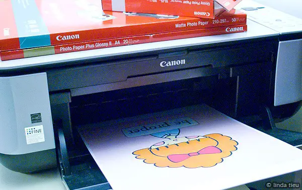
I personally have a very inexpensive “home office” Canon PIXMA MP240. It’s nothing special, but does give me a lot of flexibility when it comes to borderless printing at any custom size. It’s not the best out there, but the quality is pretty darn good and more than anything, it’s about understanding how to maximize my printer’s potential. Let’s use and make the best of what we’ve got!
INK
An extremely important aspect for me, is to use ink from the same brand as my printer. I know that it costs and might seem like all the same thing in the end. But if you think about it, there’s a compatibility when you use products from the same company – whatever that company might be. They test and use their own products, so that it works together. When they claim that pigment ink can last up to 100 years, it’s on their paper and using their ink.
I personally don’t know if the generic brands are really the same thing chemically or not. However, instead of fussing around with injecting refills which I abhor doing… I always go with the name brand. I think it’s totally worth it and makes a difference. There are exceptions I’m sure and I think the only way to go is to test and see what works for you at the best price.
PAPER
Another major component in the quality of your print is the paper choice. In fact, I think it’s a pretty HUGE deal. I use Canon brand papers with my Canon printer, but sometimes opt for other professional papers as well. The key here is professional. There is a huge difference. Just do a comparison. Print on regular paper, on photo paper, on canvas, different brands, etc. You will see the difference in vibrance of color when printing on regular cardstock versus photo paper. Perhaps you can see in this photo how much more bright and true to color the top sheet is – matte photo paper, versus the bottom which is regular cardstock – same printer centers. It’s about how the paper absorbs the ink.

The bottom sheet looks completely washed out by comparison, right? And no, my printer was not running out of ink, I actually printed on the cardstock first and realized my mistake! The reason why photo paper looks so much better is because it’s manufactured to capture vivid and bold colors. The ink doesn’t sink down and become absorbed by the paper and fibers. That’s why there’s always a right side to print on and the back side, has their logo and looks dull. I also print on high resolution paper that is much brighter white to begin with – ever realized how dull and yellowish regular copy paper looks? That aspect also makes a difference in your end product.
Your best bet is to print test prints on the different types of paper you have. Just print a tiny 1inch by 1inch square, something large enough so you can compare with perhaps a crop or graphic that has different colors. You’ll see the difference in how your paper takes your ink and can make a judgement from there. Obviously, for whatever budget you have, get the best quality you can afford and go with that.
SETTINGS
A huge tip when printing from home is to set your printer settings on the best quality possible. There is a noticeable difference between high quality and standard quality in my experience. Some people don’t use the high quality because it uses more ink, so you just have to do a bit of testing and see what is acceptable for you.
Selecting the specific paper you are using also makes a difference. If you think of a putting a puzzle together, when you have all the right settings, your image will look great. When you don’t have them matched up properly, it can be off. Dig into the printer menu and settings! Look through everything and understand what options your printer has.

I usually print directly from the preview image program on my Mac – simply because I prefer the menu options. Of course, you can print from any graphic program and simply open up your printer settings specifically.
Things to check:
- What are you printing, how many copies? Consider doing a test first! Can you see a preview?
- Select your proper paper size
- Select the proper sizing for your image – do you need to scale it down? (my girl art prints are 10″x10″ at 300dpi, so you usually will be sizing them down. the even number makes it easy to just enter percentages for whatever size you are going for, 50% for 5″x5″, etc)
- Select the proper paper type – it makes a huge difference!
- Select the highest print quality possible

I have certainly run into problems myself when printing at home, but I know from experience that it simply took a bit of education and experimentation to find the sweet spot. When I tried all the Canon products together, my prints looked pretty fabulous! In fact, I have upgraded and use even the super thick fine art museum etching paper – and WHOA it makes a huge difference!

So give printing at home a try and know that it takes just a bit of experimentation to maximize the use of your printer. These days, the quality is really fantastic.
I should note that if you aren’t satisfied with the quality at home, you can always send the image to a profesional printer or even a photo printing service. Anything printed as photo quality looks significantly better!
Let me know if you have any tips and tricks for printing beautiful artwork at home. How you find the process of printing at home? I know that with different equipment and materials, we will all get different results. I also know that some artists cringe at the thought of letting others control the quality of their work. However, I want my girls to spread far and wide and I want people to see them and feel better seeing them! Even if it’s maybe not that vibrant of a print, I don’t think it degrades the worth of the original work and idea. I think that the power of the visual imagery and message, still carries through. So although it’s wonderful to see the high quality prints, I think the not so professional copies still have just as powerful effects. I suppose that in this digital age, it’s no longer about that physical tactile item sometimes. It’s much greater and intangible…
by Linda | Feb 27, 2012 | my creative journal
Have you seen Babiekins Magazine before? It’s about style and comfort for your kids, featuring fashion items, new designs, party ideas and projects for your children. It’s a beautiful magazine with stunning photography and styling. I love how it inspires us all to be a bit stylish and trendsetting, especially our cute little ones. Ultimately, I think it motivates mother and child to see all the beauty around us.

I had the honor of creating an illustration for issue 8 and had so much fun drawing up those stylish children characters. Check out the magazine for yourself and take a peek on page 85-86. (You might hear music from a video that is on page 71-72, super cute!) I’m so proud of my little accomplishment, so had to share the news.
And in even happier news, Babiekins is actually going to be in print October 2012! It’s refreshing to know that beautiful magazines will still be printed. Sometimes you just want to physically flip through inspiring images, you know?